MACHINE LEARNING 2

Two models are built with a ML technique. Decision tree technique is used in
order to predict the “CPI” values whereas random forest technique is used to
predict the “temperature” values.
Decision Tree

Decision Tree

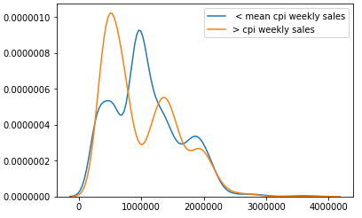
In our Decision Tree ML model we focused predicting whether or not CPI values
in each date were under the mean or above it. In order to build this model we first
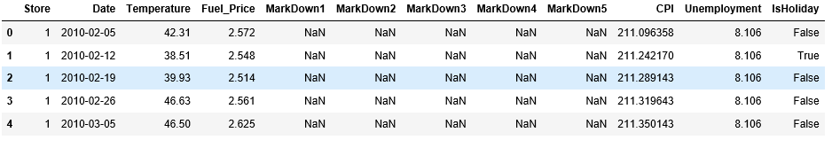
got rid of the features that were not useful to predict CPI values like Date, Year,
IsHoliday and Markdowns. Than in order to map the CPI values we renamed the
current CPI column that contained the values to ‘cop’,took the mean of all the
values in this column and then created another column named ‘cpi_mod’ which
stores binary values allocated by whether or not the CPI value of the corresponding
line was below or above the mean (1 for above, 0 for below)
cop_mean = walmart_features[“CPI”].mean()
walmart_features[“cpi_mod”] = 0
walmart_features.loc[walmart_features[“CPI”] >= cop_mean, “cpi_mod”] = 1
The attribute we wanted to predict and other features are used to create a dataset
with 70% of the original dataset as train and 30% as a test data set to evaluate the
Decision Tree
y = walmart_features[‘cpi_mod’] # this is what we want to predict.
X = walmart_features.drop(‘CPI’,axis =1)
X = X.drop(‘cpi_mod’,axis = 1) # these are our features
X_train, X_test, y_train, y_test = train_test_split(X, y, random_state=42, test_size=0.30)

The above image shows the accuracy score of our Decision Tree and it can be seen
that it has resulted with the perfect score of 1 which means that the model
predicted each CPI value correctly. The results can be evaluated more clearly with
the confusion matrix as seen below.

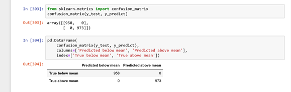
It is sensible that the model’s predictions aligns perfectly with the real data since its accuracy was 100% which means that our model only predicted the CPI below mean where it was originally below mean and as above mean where it was originally above mean.

Project Evaluatıon

– What were the difficulties you encountered during the project?

Difficult part for the group was trying to capture the motivation behind this project. Frankly at first , we thought we will just have to deal with reading the data and analyzing it , not actually modifying it for such reasons(building machine learning models, applying linear regression for various feature sets etc). Besides, Our data’s range was not exactly equal because there were some extra dates in train.csv which creates missmatches on our graphs.

– If you were given sufficient amount of resources, what additional datasets would you utilize?

We would’ve wanted a more correlated Consumer Price Index attribute to other attributes since group discussions always lead to the idea that CPI actually effects Fuel Price, Unemployment and Weekly Sales in our datasets. Moreover, we could use inflation rate in our data to have more accurate correlations. Because we believe that inflation rate has a negative correlation with weekly sales, fuel prices and CPI.

– Compare the machine learning algorithms you used, in terms of performance and applicability to your dataset.

First of all, we used decision tree algorithm and random forest algorithm for building machine learning models within our datasets. Random forest, in our opininon, was more applicable to our dataset and since its builded on decision trees, it is actually better in terms of performance

– What improvements could have been done in your project?

it is a fact that walmart is not the only supermarket chain in the United States. So, we could gather more supermarket chain brands’ datas together and have more accurate results. Maybe, we could find better correlations between our data types.

Machıne Learnıng

Two model is built with a ML technique. Decision tree technique is used in order to predict the “CPI” values whereas random forest technique is used to predict the “temperature” values.

Random Forest Algorithm

Random forest algorithm creates decision trees on randomly selected data samples, gets prediction from each tree and finally selects the best solution by means of voting.

Below diagram explains how the algorithm work:

Random Forest Algorithm

Temperature was our target label while we are using this algorithm. As a first, target label to 0 and 1s with mapping. Afterwards, training and test splits from the original data frame are created. Taking into account that classification is done according to the mean temperature values, train and test lists showed us that temperature values are ​​distributed evenly.

This lead to a high accuracy which is calculated as 0.92106.

Below figure states the performance of the model.

Random forest models can also be used to determine the feature importance. A bar plot is created in order to observe the most important feature. Below plot represents the feature importance scores. CPI has the highest importance score compared to fuel price, unemployment and store.

Buıldıng a Sıngle Lınear Regressıon Model for Predıctıon

Linear regression is modeled in order to see how unemployment is affected by CPI and fuel prices. Linear regression aims to model the relationship between two variables by fitting a linear equation to observed data. One variable is considered to be an explanatory variable and the other is considered to be a dependent variable. Before attempting to fit a linear model to observed data we examine the data with scatter plot in order to determine whether or not there is a relationship between the variables of interest. Scatter plot showed us that there is no correlation between CPI and the fuel price which is mentioned in the previous section of the report. Study is continued by finding the linear equation which is stated in the below figure.

Coefficient of the features and the interception point for the equation are also calculated.

Calculated coefficients are negative. It shows that for every additional count in CPI we can expect unemployment to decrease by an average of 0.0152 whereas for every additional count in fuel price we can expect unemployment to decrease by an average of 0.3385. As a result, linear regression score is calculates as 0.10136. This value is really close to zero. Therefore, we can conclude that unemployment is not affected by CPI and fuel prices.

https://lh5.googleusercontent.com/avlivnrnC2pVjhwJeEXLVFqkzm0Mw1SWW8HCWO7HRTjU3WuvReNQGy0bNyTpVH_Q4f3BXZale3mLnX4Cfpy_88JzckdguCo49y2oTf-9PURW3Sb2vl9tZAbwv2URpKo0t7fLnXv1
Linear Regression Model For Unemployment


Formulatıng Hypothesıs and Performıng Hypothesıs Testıng

Weekly sales values and CPI values are used in the hypothesis testing. Weekly sales are set according to the minimum and maximum date data. Then, CPI values between minimum and maximum date is taken and added to the data frame with their dates. Hypothesis is “as CPI increases weekly sales are decreases”.

Hypothesis Testing

Weekly sales values and CPI values are used in the hypothesis testing. Weekly sales are set according to the minimum and maximum date data. Then, CPI values between minimum and maximum date is taken and added to the data frame with their dates. Hypothesis is “as CPI increases weekly sales are decreases”.

Statıstıcal Analysıs

Exploring and Describing Data

Data’s are obtained from “features” and “train” datasets. Figure 1 represents the “features” dataset which consists of four attributes. Namely, “temperature”, “fuel price”, “CPI”, “unemployment”.

Data gathered from features file

“Is Holiday” column indicates whether the values are according to weekdays or holidays in bool variable.

Figure 2 represents the “train” dataset where the “weekly sales” are extracted.

Data gathered from train file

Analysis of Data Tables

In order to, explore data further, two histogram analysis is being made. we have two questions to answer with histograms

One is, to indicate “how sales changes as year changes”

How sales changes as year changes

Other one is, to indicate “how total number of sales varies in weekdays and holidays”.

How total number of sales varies in weekdays and holidays

Later, we applied scatter plot analysis in order to check whether there are any relationship between the attributes. First scatter plot shows the relationship between fuel price and CPI. According to the scatter plot there is no correlation between those attributes. There are several different CPI values corresponding to the same Fuel Price level. The reason behind this is that the scatter plot chart created contains CPI values of different stores and the values for each store are grouped together. The CPI values lie flat alongside the increased fuel price which shows that these two attributes are not correlated in every store.

Second scatter plot shows the relationship between unemployment and CPI. Plot indicates few alignment within the data but in overall, there is a negative correlation. The data are grouped in this scatter plot, too because of the reasons explained above. Relations between CPI and Unemployment for each store are visible and in all of them the Unemployment rates are decreasing as the CPI index increases. These results can be evaluated as a low negative correlation between these two attributes. Third scatter plot shows the relationship between fuel price and unemployment. It is similar to the first scatter plot since the unemployment rates are flat as the Fuel Price Index increases, at each store’s region.

It can be concluded that, unemployment is stable as the fuel price is changing and there is no correlation between them.

Scatter for Fuel Price and CPI
Scatter Plot for Unemployment and CPI

Third scatter plot shows the relationship between fuel price and unemployment. Unemployment is stable as the fuel price is changing.

Scatter Plot for Fuel Price and Unemployment

Group Project

Artun Sarıoğlu – Bora Yaşar – Deniz Nil Cengiz – Deniz Ulaş Tura

Problem:

  • Our main problem was relation of outer factors such as temperature, fuel price, CPI and employment with walmart’s weekly sales.

Data:  

  • In the project, We are going to try to conclude that CPI of the district and supermarket sales have a strict correlation. Besides, We are going to discover the relation between unemployment level, fuel prices, temperature and supermarket sales in particular time.
  • To have accurate correlation, We extract our data from https://www.kaggle.com/iamprateek/wallmart-sales-forecast-datasets.
  • In that data, we have the information of unemployment level, avarage temperature and weekly sales for every week of a given period.
  • Our data contains each data that I explained above for 45 supermarkets of Wallmart and 99 departments belonging to each supermarket which gives us a chance to make an accurate conclusion.
  • Data has more than 10000 tuples in it and it is easy to match because of the specific dates.

The Consumer Price Index (CPI) is a measure that examines the weighted averageof prices of a basket of consumer goods and services, such as transportation, food and medical care. It is calculated by taking price changes for each item in the predetermined basket of goods and averaging them. Changes in the CPI are used to assess price changes associated with the cost of living; the CPI is one of the most frequently used statistics for identifying periods of inflation or deflation.

investopedia

Process:

  • We take first 10 supermarkets which has highest weekly sales to obtain a bigger sample for statistical datas.
  • We fill take out the datas for each individual supermarkets and their temperature, unemployment levels.
  • We look at the correlation between those datas.
  • After all processes are done, we will gather the correlations together to see if every supermarket have same correlation.
  • While analyzing the data, we use hypothesis testing, machine learning techniques and linear regression models to have accurate conclusions.
  • Finally, Our conclusion will be obvious to state a conclusion.